
Brief
Conduct a heuristic analysis of existing Whole Foods self-checkout kiosks to understand the human computer interaction logical flow.
As part of an experiment effort to dive deeper into the more technical aspects of human-computer interfaces, I took on the challenge of analyzing a process I was quite familiar with in order to find ways to improve upon process.
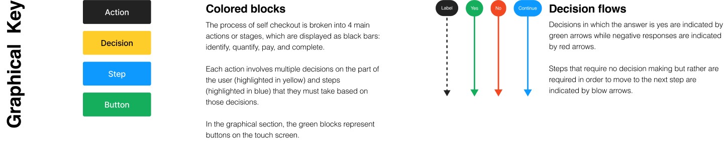
This study was broken into four main phases – Logical Flow, Spacial Layout, Interaction Diagram and Critical Lens.
PHASE 01
Logical Flow

PHASE 02
Spacial Layout
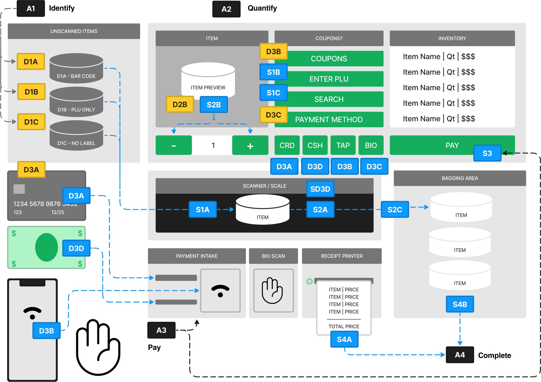
The chart below corresponds with the various actions from Part 1. Blue dashed lines indicate the flow of actions while black dashed lines label the components.
PHASE 03
Interaction Diagram
This portion visualizes the intricate dialogue between the inputs of the human user and the outputs of the program.

PHASE 04
Critical Lens
Key Inflection Point:
The goals of the successful implementations of a smooth interaction are symbiotic for both the user and the business.

Pain Points
Cognitive Overload
Users encounter numerous options (e.g., payment methods, coupons, item types) that increase decision fatigue.
Inefficient Interaction Flows
Complex workflows, such as entering product information or scanning items, cause delays.
Accessibility Barriers
Lack of support for visually impaired users (e.g., braille or tactile interfaces) and limited language options.
Limited Guidance
Text-only instructions lack supplemental icons or visual cues, leaving some users confused.
Opportunities for Improvement
Streamlined Decision-Making
Reduce the number of options presented at once by using step-by-step workflows.
Accessibility Enhancements
Add braille support, voice guidance, and multilingual options.
Enhanced Visual Design
Incorporate icons and color-coded cues for better navigation.
Improved Guidance
Use interactive tutorials or pop-up tooltips for new users.
Conclusion
The heuristic study confirmed that the current self-checkout system presents significant challenges in cognitive load, accessibility, and workflow efficiency. Users struggled with decision-making due to the abundance of options presented simultaneously, and accessibility needs were not adequately addressed. Furthermore, inefficiencies in receipt printing and error recovery contributed to a sense of frustration for users.


